Friday, December 02, 2011

QR Code Blunders #2: Heinz Ketchup - Our Turn to Serve

This is the second in the series of QR Code blunders, which I think is not as bad as the first, but a little unfortunate given the worthy goal. This time around, Heinz Ketchup features a QR Code on restaurant squeezy bottles of ketchup, which can be scanned to quickly help you support veterans. The idea is that you scan the QR Code, and either 'like' Heinz Ketchup on Facebook or send a veteran an electronic postcard, and Heinz will make a 57 cent donation to the Wounded Warrior Project.

Here is a photo of the bottle, sitting on the bar at a local watering hole. There is a nice blurb about the project and a decent sized QR Code to scan. Now, this restaurant has decent lighting, but I still have an older iPhone (the 3G), which does not have autofocus. Still, it can still take a decent enough photo and scan a reasonable QR Code. In this case though, the blunder is not in any of the instructions, or the size of the QR Code.

In this case the blunder is a simple one: the QR Code contains a full length URL (not a nice shortened one), so the number of blocks that make up the QR Code are a great many more than is necessary, making them too small for older phones to pick out clearly. I'm not the only person in the world still toting an older iPhone or Android, which is why this is unfortunate.

When I got home, I did a little image manipulation to see what the QR Code contained. Here is the link I managed to get out of it:

 http://www.heinzketchup.com/rd/btrestaurant

And please do take a look. There is nice mobile friendly website under it, and more importantly you too can add your own little contribution through a like or an e-postcard.

What should the QR Code have looked like? Not like the one below that I extracted from the bottle. Way too many blocks. 


Here is more what it should have looked like (I faked the blur and background on this for effect to show how larger blocks show up better). A shortened URL like the one that this contains ( http://cnsd.co/7vq ) takes just a few seconds to produce, and generates QR Codes that are readable in worse lighting by older phones.
Can't scan me? Browse to: cnsd.co/7vq instead

The rule is to always, always shorten a URL before creating a QR Code. This gives you three benefits:
  1. a more readable image on more phones in poorer lighting or printing conditions
  2. the advantage of being able to track scans (how many, when, location, etc)
  3. a URL that is easier to type in on a mobile phone keypad if the user just can't scan the thing (11 characters rather than 40-ish)
For more information about QR Codes for effective mobile marketing and producing mobile websites to support them, visit http://consected.com/mobile


A post from the Improving It blog
Let us help you improve your business today. Visit www.consected.com

Monday, November 14, 2011

QR Code Blunders #1: Beck's Vier Ireland

I've been meaning to start this series of blogs for ages, and tonight I realized that I had too big a blunder to miss. This is a QR Code blunder that is just too big to pass up. I'm currently in Dublin, Ireland, a land where competition for beer consumers could be considered to be large. Very large. So seeing a QR Code on the beer mat pictured here, I had to go with it.

The QR Code on the beer mat could be considered to be a smart marketing ploy (it is one I have suggested in the past and actually have a small, regional client in the UK doing). Imagine this following scenario. Think of grown men, in pubs in Dublin during the day, a bit bored while their friends go off to get another pint from the bar. Ooh, shiny object (QR Code), let's see what it does.

Well, in the case of the Becks example, not a helluva lot. Or if you have an older iPhone, even in great lighting (not renowned in pubs, anywhere), nothing at all. Beyond the fact that the QR Code is too small to scan and doesn't use a shortened URL, so it is more pixelated than it needs to be, there are a bunch of other failures:

  1. the URL points straight to the Facebook page they want you to visit - there is no real way to track this action and see how many people scanned that QR Code, so who knows whether the beer mat QR Code campaign is working? Just the webmaster at Facebook and I don't think he's going to tell you that for free
  2. the URL points straight to the Facebook page they want you to visit - "so you want me to login to the really slow mobile facebook page that my QR Code scanner sends me to so I can see the page? Oh look, here comes my pint. This thing is a joke."
  3. the URL points straight to the Facebook page they want you to visit - I forgot, this is Dublin, and the Guinness has to settle on the bar twice as long. I had time to login to Facebook. First thing I see is some irrelevant post about architects having more creativity than artists. Or something unrelated to beer (despite the really small tag line I missed at the bottom of the beer mat about turning beer into art). "Childish male drinking humour almost kicked into my brain sitting waiting for my pint - art, rhymes with...? Ooh, pretty girl just walked past. Where am I?". No click on the Like link should be expected.
So my pint turns up, and Beck's still only has 2184 Facebook friends, and everybody thinks that QR Codes are a stupid idea. Not really,  you just have to do them right and target your audience better.

Cheers to them for giving me a great example to kick off this series of QR Code blunders. And feel free to visit the Facebook page for the unreadable QR Code at http://www.facebook.com/becksvierireland (I had to take a photo with a good quality digital camera, then photo shop the image to get it to scan.) 

I hope that Bulmers, the owners of the distribution rights to Beck's Vier, and eightytwenty/4D who announced with such pride that they are handling the digital activity for the Bulmers brands realize the error(s) of their ways. And its easy for me to criticize here and now without offering solutions to the problem, but let me suggest that QR Codes work if you actually try scanning them with a real phone, life-sized, before going to print. And you don't rely on Facebook for your MAS (minimum attention span) marketing to mildly intoxicated blokes.


A post from the Improving It blog
Let us help you improve your business today. Visit www.consected.com

Thursday, November 03, 2011

Go Mobile, Global

Google is finally shouting about mobile websites. They have released GoMo and are putting on a mobile event in Alabama to start pushing businesses to convert their regular websites to a smartphone-friendly format. At Consected, we feel we need to crash the party, although we're not going to Alabama. We're not even going on the road. Read on to find out about our global party-crashing plans...

Google probably feels it can focus on mobile websites having reached a milestone with the Android platform, overtaking Apple and the iPhone as the operating system the majority of smartphones are running. They have 200,000 apps on the Android marketplace, although a large proportion of these are meaningless copies of poorly performing websites, with little or no advantage to Google in promoting their advertising. So Google has (rightly in my opinion) decided that real, mobile-friendly websites need a little helping hand. and GoMo is the way they are shouting about it - along with some expensive sponsored listings from vendors who they claim can get businesses going fast. But before you go, let's revisit why you want a mobile website and not just an app.

A mobile website helps every potential customer who wants to use a service, not just the limited number who have a phone that works with the app. Apps are great for software developers who have a contract from big corporates to build them, first on iPhone, then on Android, then maybe a Blackberry version. Apps are great for consumers playing games and using real productivity applications (think of Excel on your phone). They are completely unnecessary for the majority of mobile marketing requirements (I don't need an app to search for special offers from my favorite retailer, TalFart). And, as people are starting to find out, many apps don't work well on tablets like the iPad or Galaxy Tab, well unless you like a pokey little mobile phone sized app in the middle of your large screen, or want to pay the developer even more money.
Holsworthy Ales mobile site
A very recent new client

Having a mobile website is essential if you have a business with customers on the go. So feel free to try out some of the services that are being touted through the Google website. Please accept a little advice though -- spend some time really looking at the result. A nice menu, all the text from your website pasted blindly on the page, much of it irrelevant to a customer trying to find you on her smartphone. Everything else stacked at the bottom, as the robot creating your site didn't know what to do with it. And really very little control over the end result (pink or blue is about the choice). This is why Consected wants to crash the mobile party. A mobile website is not just a vertical version of your current website. It needs some TLC and a real person.

Here is where we crash the Google GoMo party. We will create a custom mobile website, by hand (think of an artisan mobile website) for any customer who prepays for a 12 month mobile website hosting service with us. You'll get:

  • a real, working, zero effort mobile website
  • a home page following the style of your current website
  • a contact page with "tap to call", "tap to map", "tap to SMS", and links to your Facebook, Twitter, YouTube and LinkedIn pages
  • up to three pages describing your services or products (we'll even edit the text to make it useful and concise)
  • your logo in the header
  • ad-free and our logo does not appear anywhere on the page
  • QR codes for every page
  • your own domain name linked to the site
  • free access for you to login and change any part of the website you desire 
You don't have to be in Alabama to claim it. You don't even have to be in the US. The time for us to build the website by hand exceeds the value of the hosting service, making the mobile site effectively free. Free is a pretty good deal for a mobile website that looks professional, useful and something you can use to promote your business.

To join us in crashing the Google GoMo party, and claim your own mobile website, built by hand, just fill in this quick form: http://cnsd.co/5n5


A post from the Improving It blog
Let us help you improve your business today. Visit www.consected.com

Tuesday, October 11, 2011

Mobile, local and loyal - small business customers

Local, mobile and loyalty.Deals for real people
Many people are saying that the daily-deals sites like Groupon are struggling, especially after they turned down a once in a lifetime $6BN opportunity to be acquired by Google and had to drop a proposed IPO. The reason I believe is that consumers are maturing, or maybe just reverting to human nature. We shop, eat and enjoy ourselves more when we don't have to travel halfway across the country to do so. Daily deals give the impression of offering local offers, but local just means Massachusetts or Ireland, not Boston or Dublin. People are getting tired of this and so the announcement today by theadmenu.com about a new local online service [also see the Irish Press Releases site] is really interesting. I've been working with theadmenu.com for a little while now, so this makes it even better!

If you run a small business, a shop, restaurant, bar, hair salon, car dealership or lunchtime deli, you know that your customers typically come live or work close by. They are local.  Since you have the type of business where the number of feet through the door is proportional to the amount of business you do, you know that you need to catch the attention of people on the move. Your potential customers are mobile.

The thing that many small businesses struggle with is persuading customers to come back again and again. Your most profitable customers are not one-offs, they provide repeat business and so you need loyalty. Beyond one on one exceptional customer service, loyalty is hard to promote. But we all know that there is big business in loyalty, since every big brand store, every airline, even the railways have loyalty programs. The question is how can smaller businesses get in on this?

TheAdMenu, the new service I've been working with, is based in Dublin, Ireland and aims to address "local, mobile and loyalty" for local businesses. It is quite simply a mobile-friendly website that uses the location services of smartphones (also known as GPS, geolocation, satnav, etc) to help customers find the services they want in the local area, at the best price possible. And it then takes the one-off special offers, and helps customers and businesses benefit from loyalty, by making it easy for business to provide repeat promotions to existing customers, and customers to find out what deals or new services their favorite shops are offering.

Mobile sites, like the cities that will be represented by theadmenu.com should be targeted at their local audience, not just a way to try and sell the same old stuff to bored commuters across the country with iPhone or Android in hand. With Consected mobile sites technology, I'm proud to be helping TheAdMenu deliver simple loyalty programs to local business that want to attract and retain mobile customers.


A post from the Improving It blog
Let us help you improve your business today. Visit www.consected.com

Wednesday, October 05, 2011

Apple does little but keeps app developers busy

Apple collected a lot of tech reporters together for an event to make a big announcement. Everybody held their breath, guessing at what the next big revolutionary change would be in the mobile space. What huge leap would we see in smartphone technology? According to Mobile Marketer's Chantal Tode, this amounted to not a lot except that the Apple iOS update poses challenges to existing apps in App Store. Yes, there is an iPhone 4GS, the next version of the ever popular smartphone, but its not ground-breaking. Instead, it was time for the operating system software, the "face of the phone" to move forward.

And this represents a dilemma for many people. Unless you are desperate, you're not going to buy a 4GS, knowing that the chance is greater than ever of an iPhone 5 with a great new screen and cool new stuff being just around the corner. If you are the owner of the iPhone 3 (like me), with a device that is running slower and crashing more than ever, will you even have access to the new iOS upgrade to hopefully fix some of your issues introduced by Apple's previous update? That could give your phone a few months more life (hopefully not screw it up even more), perhaps putting you in the running for an iPhone 5 (not me, I'm going to try Android next time).

And for app developers, the guys and girls building all the apps you find in the App Store, the 200 new features that could help some apps work better, break others, and finally completely replace others still, make for a busy time. The iOS software is tired, it need some TLC to make it more desirable, and hopefully add some of the missing essential business features (rich text emails for example). It needs to allow me to get notified of things that are going on with less pop ups. But any major change to an operating system represents a challenge for developers. In testing, in new development to benefit from new features, in quick fixes and late nights.

Of course, if you don't want to have to worry if your business's mobile app will work on iPhone 4GS, 5, Android, Windows Mobile, etc, etc, then it is worth considering developing using open standards like HTML5. Otherwise known as good old "web development". With some work, a mobile optimized website can avoid the constant arms race against for each vendor you want to support, giving you a consistent, easy to use and highly functional mobile website or app.

Thanks Apple, I won't hold my breath until your next big smartphone breakthrough. Mobile web optimized apps are already on their way, and companies like Consected are making them more about configuration and self-contained solutions, and less about development.

A post from the Improving It blog
Let us help you improve your business today. Visit www.consected.com

Monday, September 12, 2011

Being mobile is having a location

Location matters, even online. We are social creatures. We love interaction with real people. We don't just "like", we love people that we have conversations with (even on Twitter and Facebook). This human nature extends to "being local". It is not just for reducing a carbon footprint that people are interested in local businesses. We like our communities, and we love the businesses that serve them well. Yeah, we can all jump in the car and drive for an hour to the big box store. But there is a warm feeling that comes from chatting to a local shop owner before buying something, then stopping for a coffee at the local cafe, or a pint at the pub. So how on earth does this work when you are online?

It is alright to have an online personality. OK, its better than alright, it is essential, if you want to be part of the social media conversations that people crave. So if you have a personality online, why can't you have a location too? Everybody recognizes that your presence is faked if you appear to be online 24 hours a day. Instead you are somebody real if you are in a location that finally recognized it was time for the sun to set and you to go offline. That is only one way to have the appearance of "location". If you truly are a local business, one that requires people to inhale the aroma of your coffee as they sit and enjoy sipping it, or discussing the merits of this widget over that one when fixing a blocked drain, then you need to go a step or two further. 

As a local business, having a website is essential, even though 99.999% of the world's population will find it irrelevant. But you do want your online presence to be relevant to 100% of your local population and visitors who might want to make use of your services. For this, your website needs to do three things:

1) help people find you
2) help people learn more about how you can help them
3) help people remember you

Maybe you'll be surprised that being local to people online is easy. In fact, you can be closer to potential customers than perhaps you would like to be in reality: nestled in their pockets and purses. Yep, you need to be on the smartphone that people resort to when they didn't plan well enough before leaving the house so they can find your address, in Google mobile search results when they are looking for a place for lunch, or finding out how to fix that blocked drain from somebody who knows. Being mobile is having a location close to your customers, whether they search for you or scan your local newspaper ad with a QR Code. Having a website just isn't enough.

With a mobile friendly website, people can find you when they are close to you and ready to buy (there are some trick to this that make it work even better). They can learn what you have to offer when they have found you. And if you are smart they can remember you by a quick click to Like their Facebook page, follow them on Twitter or join your email newsletter. Because the best customer is the one who is local and comes back again and again. Being mobile gives your location and online personality a meaning, and gets you more of the best customers.


A post from the Improving It blog
Let us help you improve your business today. Visit www.consected.com

Friday, September 02, 2011

End of summer - plan for better, not cheaper

The corner of Wall Street and Broadway, showin...Image via Wikipedia
Is it me or are the days feeling noticeably shorter already? There are pluses and minuses to the end of summer. Kids are back at school, the weather is cooling down and companies are planning for next year. Depending on your viewpoint, all of these can be good or bad. It is also the end of the year when companies in the US start to really look at what the outlook is for the next year, and what resources they need to achieve their goals. 

For many, this end of year 'planning' is unfortunate, since this often relates to cost cutting and downsizing. And as the news already starts to leak out about large corporations across the country shedding staff, I know that the end of the year can really be a time for corporate change. But why can't change occasionally be a good thing? We rarely hear about companies planning to improve business processes, bring in new trainers to help employee development, or add new websites to improve online customer service.

Unlike politics, where it seems politicians rarely have time to do anything positive before they are back on the road for re-election, companies could take the option for longer-term planning and change. The reality of the situation is that stock price drives decisions, and Wall Street and the City vote on a daily basis how we should feel. How often does the Board of Directors vote in favor of the CEO with long term goals at the expense of short term stock price?

At this end of the year I would love to see companies present a positive approach to their investors. Aim for growth, by changing things that help  attract new customers more easily, retain customers who buy more, and develop employees to be more productive happily (and not just through fear for their jobs). And I mean present this approach as real strategies, not just investor spin.

I'm already working with companies making changes for the better, so I hope this is a sign of renewed fortunes in the economy. Business processes, employee development, software and marketing all go hand in hand. Let's consider how we can work with next year's forecasts for a turn-around in fortunes, by using the tools we have available for real, positive change. 


A post from the Improving It blog
Let us help you improve your business today. Visit www.consected.com

Monday, August 29, 2011

The Consected Blog on Alltop

The Consected Blog has just been added to Alltop along with other great business technology sources, so take a look at what is out there. And welcome to Alltop readers as well.

With some new inspiration, I'll be back to blogging about business technology and mobile marketing very soon.

Phil

A post from the Improving It blog
Let us help you improve your business today. Visit www.consected.com

Wednesday, July 20, 2011

Reporting - or processes 'gone bad'?

My clients have a range of experience in improving the way their business processes run. They range from "expert" to "what's a business process?". After a little while working together, they generally come to the agreement that the Phil Ayres view of the world is that "everything is a process". Not in a bad, bureaucratic way. Instead, if there are a series of steps to be followed to achieve a task, and you have to do the same work more than once, why not make it easier for people by providing them guidance for what to do next, and maybe even automate a little to remove the drudgery of some really repetitive activities? Not surprisingly, I would treat many of the reporting functions that businesses perform as potential processes, gone bad.

Businesses create reports of everyday activities for many reasons. They believe that it is to provide supervisory control over the work that people are doing, to make sure that nothing is missed. In reality, mostly reports are created and used just because that is the way the back-office computer system manages can tell them what is going on. Why reports? Because it is easy for a system to put together a snapshot of data of the status of work, and dump it onto paper. Many systems have very little understanding of a business process, beyond the series of options they present on screen during data entry. A report is the best they can do.

Reports can be really troublesome for businesses. They represent a queue of work from yesterday, or last week. The information on them is already out of date, and there has already been a lag in handling any of the items on the report. Sometimes, batching up work like this can lead to more efficiency (i.e. less overall manpower required to finish the work), because one person plods through each item in turn without having to thing too hard. Sometimes, it just means that people get upset waiting for a response to a simple question. Really, if a report represents a list of work that is currently outstanding, and tomorrow it will show the same work with a different status, how does it really help us, beyond showing us that we have work?

Of course, sometimes you just can't get away from reports. They make sense. They show what is going on in the only way the back-office systems know how. In many cases, managing people from the information on a report is going to lead to trouble. In other cases, I have been asked to put processes around the distribution of reports, to make sure people actually read them to know what work they are supposed to be doing. In some cases, this is acceptable - its just a checkbox that says, "I did my review". In other cases you end up reporting on reports of reports.

Consider the reports you have in an organization. Look at the ones that are handed out to people to check off their work as they do it during the day. Behind each line on that report is often a business process. The person doing the work knows that process. But if that person takes a long trip to Hawaii, do you know what that process is, beyond highlights on a printout? Wouldn't it be better to notify people of the work sooner, and guide them to completing it faster? That is what business process improvement gives us. Escape from "processes gone bad".

A post from the Improving It blog
Let us help you improve your business today. Visit www.consected.com

Wednesday, July 13, 2011

QR Codes - a survey of what works

I was just pointed to this interesting survey about how effective different QR Codes are, by QR Mediacodes. The questions asked were pretty straightforward, and although the results are not entirely surprising, they do provide us some reminders of what works better in mobile marketing.

The questions they asked were:

  1. Have you ever seen or heard of a QR Code? (75% YES)
  2. Which QR Code catches your eye? (79% the colorful, attractive looking one)
  3. Which QR Code would you be more inclined to scan? (73% the colorful, attractive looking one)
  4. Have you ever scanned a QR Code?  (37% YES)
  5. Did you find the scan useful? (96% YES)
  6. Would you scan a QR Code again? (98% YES)
So, there could be some importance in making your QR Code stand out from the crowd as QR Codes become more prevalent. But as a scientific survey, I would rather see a test of what the scanning rate is for the pretty versus the plain QR Code is when they are not seen side-by-side but standalone. That is what really matters right now: will people scan your QR Code at all and is the information they land on valuable


A post from the Improving It blog
Let us help you improve your business today. Visit www.consected.com

Monday, June 27, 2011

Why do I need a mobile website?

I've been doing a lot with mobile websites and QR Code recently. Putting together a service to help people publish mobile friendly pages and actually designing and hosting whole websites. So, when I was asked today, why a company might need a mobile website, a quick list came to mind of the businesses that can use them and why:
  • Restaurants - menu, location, weekly deals
  • Bars - location, drink specials, two for ones, history
  • Wine cellar - QR coded bottles or shelf labels, linking to tasting notes and region details
  • Food supplements and vitamin - videos that show why they're different, every product has a QR code
  • Construction supplies - QR codes on specialized items, so people can identify them when they are on the construction site
  • Car dealerships - QR code on every windshield - get more details about the car without a pushy salesman
  • Real Estate agents /  Realtors - QR code for every home - on the For Sale sign and in the advert in the advertising and mailings
  • Direct mail advertising - put QR codes on the stuff that falls through the letterbox to get people into your site more easily - even better, completely personalise the post so there is a QR code for every person and a dynamically generated landing page (this is a premium offering!)
  • Insurance broker - general information, different lines of business
  • Party supplies wholesale/retail - different products offered
Anything that can be marked with a QR code or you can think of where a page could help get people interested is a good target. The aim of a mobile website is to do several thing:

  1. make a link between a paper advert and more information online - space in you advert cost money - on your website it costs 'nothing'
  2. get people engaged when they are on the move - help them remember you exist when they get home by getting them interested in your product and signed up for a newsletter
  3. help people find you when they are local and looking for a service like yours 

If you can think of a time when people could benefit from more information, that's probably a good time to offer them a mobile website!

A post from the Improving It blog
Let us help you improve your business today. Visit www.consected.com

Wednesday, May 25, 2011

Improving an "information driven" business

Some businesses are driven by events (something happened and I need to respond), and others are driven by information (lots of things happened and I need to respond to them en-masse). Flows of work (as modeled, measured and improved by business process management - BPM), take individual events or transactions and guide them through to completion. So if you are an "event driven" company, your customer requests, orders and other transactions are generally easily improved. But what if you are an "information driven" company? Get reports, print them, file them, seems to be a common option. There are some really big challenges in improving the "information driven" company. 

Around this time last year I started working with a client on what seemed like a simple electronic document management project. As a company in the financial services sector, there are needs for managing transactions, obviously, but there is a huge amount of the business that is driven by information. Compliance and Credit especially are areas where firms like this need to look at the information about clients on an aggregate basis in order to make decisions and spot red-flags. So what was needed? Well, let's just take all the reports, deliver them electronically, and those that can't be processed in that way (too much manual line-by-line, page-by-page review and annotation) get scanned and stored.

This project was eye opening, and reinforced some ideas I hadn't seen in a while. When improving a business across many business processes there are some approaches that are worth considering:

  • Avoid rat-holes by working backwards: look at the end result of the paper trail that is produced and work backwards through the people that handled the information to identify the "happy path" process
  • Use the org-chart to find natural order: people tend to work within the constraints the organization places on them in terms of departments and teams. Understanding this can help you get familiar with a new business faster
  • People hate working on-screen:  if your people must stare at reports all day long to get the information they need, it is unlikely they will transition to working on-screen without a fight
The challenge is that a well trained human mind is a great tool for analyzing and understanding patterns across large amounts of data, allowing information on reports to translate into a distillation of information and possibly events that can be understood by people with different skills. How do you represent what goes on in an analytical human mind when processing information? Can you automate it (and do you really want to?)? And how can you make the processing of this information better, faster, repeatable, and less paper-based?

There are many options, depending on a specific needs. I'm looking at tools as simple as checklist, as common as rules engines, as widely used as 'business intelligence', and as futuristic-ly  powerful as Complex Event Processing. There is definitely not one hammer for every nail when dealing with information-driven problems.

It is the challenges like these in business improvement that sometimes are not easy to address, but are extremely important. These are the fun ones!


A post from the Improving It blog
Let us help you improve your business today. Visit www.consected.com

Thursday, May 19, 2011

What's in your records?

Things have been quiet on this blog while I was kicking off a new project with a client. The good thing about this is that I have loads of ideas about things to talk about. At the top of my list is one that reinforces how important it is to maintain quality document records about a client if your customer relationship management (CRM) or equivalent client management system doesn't give you the absolute full story.

When you need to look at the whole history of a client, does the structured data you have about the client, usually stored in some sort of database or CRM system, show you everything you need to know? If you were pressed to show all the information, for an auditor or a lawyer, could you say when the client requested to change her address, when another client added a new service to his contract, or how many times a company had contacted you with a question or complaint? Although this sounds like pure CRM, I would bet that many companies with CRM in place just couldn't do it.

The problem is that clients communicate with companies in many ways - through email, the website, paper, phone, fax. If a company is good enough to have an organized repository for client communications, organized by client and type of communication (or better by the request or case), then the documentation gives you all the information you need. For this to work, you need to be sure of the following:

  • The information is complete
  • You can identify which documents and communications belong to which cases
  • The client information and related documents can be viewed side-by-side
  • There is no way that important discussions or communications with a client don't get captured
  • A full history of important client events can be easily identified without forensically picking through documents
If you have the full view of the client in this way, you have worked hard to get there - congratulations! 

Challenges come if you rely on documents for a history of your clients, but can't be sure that these documents contain a full history in a single view. This is case management, or just a complete client record if you want to avoid adding another unnecessary term to the mix. And when companies work out how to do it well, they are able to service their clients far better, and avoid troubles with auditor and lawyers.


A post from the Improving It blog
Let us help you improve your business today. Visit www.consected.com

Wednesday, May 04, 2011

Future payment transactions - not as dumb as paper

Pay by phone, the smart way to pay
(Image from Mobile Marketer)
Mobile payments technology is a hot space at the moment. The ultimate goal is to make small retail payments easy, fast and cheap for businesses and consumers. This means that the solutions have to get away from paper, coins and magnetic swipe cards with huge costs attached to every transaction. Add consumer interest in everything about mobile device apps on iPhone and Android, with location services and the ability for the devices to communicate for themselves (something no credit card can do), and there is a huge opportunity for the company that owns your data to direct your future spending with loyalty programs and offers. It is with this in mind that PayPal announced its acquisition of Fig Card - this story in Mobile Marketer adds some nice commentary.

Now that's not to say there aren't challenges with mobile payments. If it was all as easy as just tapping your phone on a black box to pay a retailer, we'd probably not be carrying cash already. The challenges amount to these, and Fig thinks they know the answers:

  • Making the hardware retailers need simple, cheap and secure
  • Getting enough retailers interested in doing something different
  • Educating consumers on a new approach to payment
  • Ensuring that consumers don't need new hardware, just a new app
  • Building a secure infrastructure that can capture payments for a retailer without them ever storing consumer's details
  • Being able to scale the infrastructure to support a nationwide, then international payment infrastructure
  • Putting together value add features such as loyalty programs that offer consumers more and make the service pay for itself
PayPal seems to be in a good position to offer much of this know-how and the backing to make it happen. Fig Card gives them the opportunity to go out and chase the incumbent credit cards with a viable alternative, addressing most, if not all of the challenges above. And they haven't forgotten the appeal to retailers, consumers, and their own bottom-line in the power of information.

If future payment "transactions can be as smart as a computer and not as dumb as paper,” (to quote Mr. Chu, Senior Director of PayPal Mobile), then PayPal could be hot on the heels of more than just the payment card industry. Move over Groupon - if you don't own the payments, you know nothing about potential customers. They may just stop coming to you, when more appropriate offers come to them at no cost.

A post from the Improving It blog
Let us help you improve your business today. Visit www.consected.com

Thursday, April 21, 2011

Don't just ask 'why'. Start with 'who'.

I was chatting with an associate in consulting firm yesterday about all kinds of software solution requirements. He shared a little revelation that put a lot of my day into perspective. He said to me something like,"I love working with vertical solutions, those things helping pest control companies, or lawn care companies, or whatever, work better. It is so much easier to be able to find the words describing what keeps the owner awake at night when you get your head into it, rather than trying to talk to the CIO of a major insurance company about strategic systems architecture". Gaining enough insight to see the issues a unique company is having is hard, but it gets so much easier when you can share war stories from similar businesses doing the same type of things. 

I have always believed in selling solutions to business problems, possibly because selling technology for the sake of technology seemed tough to me. What little salesman there is in me is true to the point I learned in "How to Win Friends and Influence People" years ago. You can't sell what you don't believe in, and if there is not a problem being solved I find it hard to get passionate about the technology. So I try hard to sink myself into business problems to make the technology desirable (to me and a potential customer).

Yesterday, I messed it up big style. I have been looking at solutions for real estate agents, among very many other industries. I have bought a house, admittedly in a different country years ago. House buying had a different set of terminology and rules, but I feel that I understand what it is like to be a home buyer. Things have moved along, and we now have smartphones, GPS, and QR Codes on the For Sale signs. Mobile websites make finding information about a house you are standing outside so much easier. I thought I could build enough empathy to feel what goes through a modern buyer's mind, and what will make them into a profitable client for a real estate agent. The thing is, I didn't keep an open enough mind to really see the power of mobile technology. I obsessed about the home buyer, the "realtor's" client. I missed the fact that an agent can benefit from mobile technology even more directly. 

Crap! I know nothing about selling houses. I know nothing about spending your week on the road visiting properties with clients. It should have been obvious to me that the agent is an even bigger consumer of mobile technology than the home buyer. It took a partner with real estate sales background to jam that thought home. Now I have it.

So, I may be the creator of some of my own thoughts, few of them completely unique I'm sure, but that doesn't mean that I know everything. Humility means that I'll assume nothing for a while and stop trying to be the expert in anything. I will ask more questions. Not just 'why' does something matter, but 'who' does it matter to. For any business involved in designing products or delivering solutions to customers, an occasional slap in the face like this is important. It keeps you grounded in not just what you think your customers want, but who your customers actually are!


A post from the Improving It blog
Let us help you improve your business today. Visit www.consected.com
Tuesday, April 19, 2011

Break bad document filing. Give folders a personality.

Anonymous and dull.
No wonder nobody really
 files documents correctly.
I have held a theory for a long time that a new application that looks like another popular application (or operating system) will encourage users to use that application in the same way, bad behaviors and all. When I first started working with document management solutions 14 years ago, the constant push was for systems that looks just like Windows. Even before Vista, Windows was not very attractive and was clunky to use (so some things never change). But companies who had invested the time and effort to get users trained up to use the new-fangled technology wanted to make as much from that investment as possible. So if it looked like Windows, people could use it without extra thought, right?!

Fast forward 15 years and we are here in 2011. Windows really looks the same, despite a constant buffing to make it appear modern and slick. The common productivity apps, Microsoft Office continue to confuse the hell out of people by moving all the menus into a ribbon that constantly shifts where you expect to find things. And buyers of new software solutions still want document management solutions to look like Windows -- because everybody knows how to store things effectively on Windows, right? WRONG!

This is the big problem. We might have spent the last 20-ish years teaching new users how to work the basics of operating a desktop or laptop computer with a mouse. But we have never taught them the importance, or even basic know-how required to effectively manage documents. We could have guided them with predefined folder structures, but we didn't. We just let people throw their valuable creations  in whatever folder suits them. 

In the future, when we realize that there is a huge risk in our business, we start to put some structure in place with a formal document management system. We want this to be the quick fix we need, but we don't want to train people, so "that system had best look like Windows or nobody will use it - I know my people!" (the words from the General Manager or similar role). And with that new system, everybody still needs free rein to create their own messed up filing systems, just like on Windows. 

Why do we allow this? Because companies often don't realize that the software or OS is not to blame for terrible filing habits, it is the users, as a direct result of the fact that we have never helped them to do it right. People don't magically learn how to file documents, whether you give them 10 days or 10 years.

I have one great way to break bad filing habits. Give users a simple document management system that looks quite unlike Windows, but does have big pictures that look like individual clients, projects, employees or accounts or whatever it is they need to be filing documents for. Give those folders a personality. You instantly break the view of a faceless system that provides a bunch of anonymous folders, "so it doesn't really matter where I file stuff". When you give real people a face to match a folder, the reality that a document relates to somebody or something sets in, so "I have to put it in the right place". This is easy behavior to influence.

The anonymity of Windows, and the lack of guidance we have given people has made document management a disaster in many companies. It can be fixed with simple improvements to software that definitely does NOT look like Windows. Document management systems do not have to be faceless and dull - giving them personality helps people use them better, and understand why they are filing documents in the right way.

A post from the Improving It blog
Let us help you improve your business today. Visit www.consected.com

Tuesday, April 05, 2011

Is the process app store the future your business processes?

Image representing iPhone as depicted in Crunc...Image via CrunchBase"Is the process app store the future of BPM?" was today's discussion on the ebizQ business process management forum. Should we buy business processes (such as travel expense processing) in an online app store, the same as we buy Angry Birds for our iPhone? As much as we would all like to believe that process applications can be delivered this way, getting a replacement business process implemented is tough. You have to:

  • find a process application that fits your needs
  • get it customized, configured and generally implemented
  • manage the change of people's attitudes and activities internally to get it to work. 
Since business processes are so much part of the DNA of a business, implementing new ones makes them extremely hard to deliver as apps. Even a simple travel expenses process or a holiday/vacation request process is done in a million different ways by a million and one businesses. Why would they want to change the way they work to fit some cheap application they bought online?

My own experience, putting pre-built process apps out on Google Marketplace is that even if small and mid-sized businesses (SMBs) come to take a look, they can rarely spend the time to really dig in and understand what the app can do. A cursory single look, a "this sounds hard" internal discussion is about the best you can expect. No matter how much person-to-person hand holding you offer (and trust me, I've offered), the typical app buyer in a small business just doesn't have the time, resources or motivation to get a real process change implemented. As Ian Gotts commented on the forum:

For an SME this is too hard. Instead, they continue to run on "staff heroics"

Now I'm not saying that the apps we deliver at Consected are always perfectly simple to use! The ultimate flexibility that is rightly demanded by the buyer whatever size company, balanced against the "so simple a caveman could do it" need, makes these applications more expensive to develop than the $4.95 per user per month cap that seems to be the limit anybody will consider (often less). 

The next issue really comes from a complete lack of change management being possible when you sell through an app model. Being able to work with a customer remotely who doesn't have time to really speak to you, or any real wish to speak to you, makes any sensible change to the current business processes really hard. The best business process implementations come with a change to the way work is done, not just moving it "to the cloud". Apps give the impression that we can just install and go.

Apps need to be really well packaged if they are delivering business application functionality through a software as a service (SaaS) model. Which means that the value of a flexible process environment is lost on the end user, because too many options just get in the way. But without the flexibility they can do their job the way they need to. Somebody will work out the magic to this, though its definitely harder than it appears! 

Successful app vendors have to play a numbers game and sell large volumes to make any real money. And business processes seem to rarely fit the one size fits all requirement to make this happen. So please feel free to take a look at the Consected Instant Apps. They are free or cheap (by enterprise software standards). And although they require a little time, thought, and some communication with us to get them to really fit your needs, they can make a huge difference to your business.


A post from the Improving It blog
Let us help you improve your business today. Visit www.consected.com

Friday, April 01, 2011

Justifying business process improvement without being a fool

Drawing HP 9830 desktop computerImage via Wikipedia
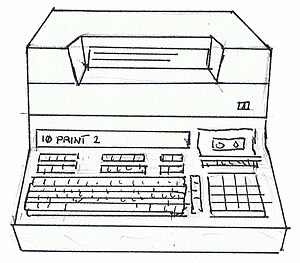
This year is the fifteenth that I have been working with business process management, document management and business information systems. Or when people ask what I do, "I'm in IT, but I can't fix your PC". Over the years not much has changed. The same business problems are still there. Companies still have an over-reliance on paper or email, because it is just too hard to get started in a process improvement project. Communications with customers are still on paper. Yep, you can get your bank statement online, but that isn't a transaction that results in a business process. Nope, processes are still manually guided by individuals driving a desk and an email account. Am I a fool to think that people want to change this?

In the last two years, I have been focusing more on small and mid-sized businesses. They seem to offer a great opportunity, hanging on through grim economic times, and needing some attention to be able to work better. The problem is that there is never a lot of money or time to spare in small businesses to change the way things are done. Rightfully, people focus on doing what needs to be done right now, trying to grow the business (or just stay afloat). The idea of adding some process rigor, to make it easier to do common repetitive tasks in the future, just doesn't figure. In many cases, a process incorporates a grand total of one employee and a customer. A checklist is a more effective process management tool than a formal workflow, and managing information, data and documents with minimal hassle is a much bigger issue.

Mid-sized businesses have process needs that are reminiscent of the processes I have worked with in giant corporations. Since the multinational monsters are always split into business units and smaller departments, the scale of what needs to be done is often the same as the requirements of a mid-sized company anywhere in the world. Which is great news, as that means I have some great experience to offer these smaller companies from my time spent with the big guys. 

The problem is this: it is far more transparent where the cash comes from to pay for business improvement in a mid-sized company than a multinational corporation -- the owner's bank account. In large corporations, you can make an ROI and justify it two levels above you, and you're still not even in the peripheral vision of the CEO. In a mid-sized company, the ROI has to be real, and offer real results.

So am I just fooling myself trying to work with mid-sized businesses? Or will the lessons of transparent decision-making make me into a better process improvement specialist? My job is no longer in fabricating an ROI for an enterprise software salesman to present to his prospect in the department of a huge company. My job is to recognize that mid-sized businesses have process problems that need fixing, in sensible, justifiable ways. And if you can't justify making a change, things will carry on fine just the way they are. 

Reality is, in 15 years my job hasn't changed. I'm still "in IT, but can't fix your PC". I just have to focus on the real business problems, not the ones that used to make a salesman a fat commission!

A post from the Improving It blog
Let us help you improve your business today. Visit www.consected.com
Enhanced by Zemanta

Tuesday, March 29, 2011

Making a big deal out of mobile

Publishing a website suitable for mobile phones used to be a real challenge. There were many factors that played into this, pre-iPhone, and it wasn't just the size and usability of the screen:

  • Bandwidth was limited (oh yes, you think AT&T "4G-is-coming-because-the-rest-of-our-service-is-sooo-slow" is bad, try booking a flight over a standard GSM connection)
  • Usability was clunky at best, Windows Mobile at worst
  • The software development tools were limited, web protocols were obscure (for standard web developers), including WAP and others, all trying to seek standardization and best use of bandwidth, and achieving limited adoption
  • The mobile devices just weren't ready for the general public's use of the Internet (I would struggle with one, my wife would throw it out the window)

Things have progressed in leaps and bounds. The devices are amazing to use. Even the cheapest smartphone 'handset' offers a pretty decent 300x400 pixel screen, completely adequate for browsing simple, standard HTML sites. We have mobile web browsers, with real browser technology squashed down from the desktop. From a distance, things look like websites.

Some devices like the iPhone 4 even boast 900x700 size screens. But that just squashes everything into the same physical size. Side by side with an iPhone 3, the new one looks crisper, sharper, brighter. But it doesn't really do much for my overall web browsing experience. iPad and other tablets aside, the phones have reached a plateau on what they seem to be sensibly delivering from web browsing capability. 

So I'm regularly asked questions like "but an iPhone can browse regular websites, right? So why do you need special mobile sites?". The answer is clear when you actually try. This blog appears okay on an iPhone, if you don't mind zooming and dragging the window around to read it. But anything with multiple columns, Flash, crazy drop down menus -- well, they're usually usable but tiring, and often just look ugly.

So you want to impress customers with your new fancy website? Make sure that those customers who are on the move can get your information fast, clearly and easily on a mobile website built for mobiles. Because you can guarantee that after waiting 30 seconds for a web page that is mostly flash and wide columns of text, they will just hit Google and search for your competitors. 


A post from the Improving It blog
Let us help you improve your business today. Visit www.consected.com

Thursday, March 24, 2011

Who says you can't have custom apps in the cloud?

IBM Cloud ComputingImage by Ivan Walsh via Flickr
When I first started down the path of building out a software as a service (SaaS) platform for business applications, a common criticism I heard about SaaS was that they were really limiting in what you can do with them. You either take the application the way it is, or you go somewhere else. Beyond a few simple configurations and changing the odd color-scheme here and there, prepackaged applications running in the cloud were limited. 

Now enterprise applications on the other hand were apparently not limited. You could spend tens or hundreds of thousands on professional services to customize the app of your dreams. So that made them better. Hmm, no wonder I often heard the 'build vs. buy' discussion during lengthy sales cycles. 

These seemed to be limited options if you needed an application that fitted your businesses:
  • build from the ground up
  • invest in an enterprise software application and professional services
  • build your app on the Salesforce platform and still write loads of code

Now I'm not saying that the argument about finding an application online to run a common business process, such as travel expense reports, doesn't mean that you are going to get whatever the vendor believes is the right way of working. And for the cost, there needs to be a general, reusable approach. You don't get a lot of options when you're paying $5 a month or less. But this is a feature of the business model (shifting high volumes of cookie-cutter product). 

If the platform has been built right, as Salesforce has shown, it is not the technology behind the scenes that prevents a vendor from offering far more configuration and customization. Salesforce has gone to an extreme it seems.  But it does show that without just building a completely new solution from the ground up there is the possibility to get software specific to your requirements in the cloud. At the same time, just like building off any platform, there are constraints that you must adhere to.

These thoughts come to mind as I'm just finishing off the testing phase of a help desk and equipment management application for a TV station "out west". I'm enjoying that I have a great platform to be building on (yes, Consected does really do some great stuff!) and can put together process and information management solutions like this really quickly with 98% configuration. I'm even happier that the platform can be extended. Not just with an API and a whole bunch of new software following the Salesforce model. But with some simple tweaks of the software itself, allowing an improvement for every client, or a completely new chunk of functionality specific to just the one client. This is the joy of owning the platform itself.

So if you ever need a custom solution that does not need the full expense and hassle of those other options, do look a little further than the closed SaaS applications that meet the needs of many, just not you. And don't assume that custom applications always require teams of software developers, for enterprise application customization or Salesforce. There is a middle ground, and some smaller vendors like Consected can provide the flexibility that the "box-pushers" can not.


A post from the Improving It blog
Let us help you improve your business today. Visit www.consected.com

Tuesday, March 22, 2011

Don't use 'personas' to hide the fact that can't do 'usability'

Personas are commonly used by analysts in collecting requirements for building new software, so that the essence of the needs of different users can be distilled and transferred to a group of developers who have never had contact with those end-users. A persona is a profile for a common type of user the software is catering to, and tries to embody not just the fixed requirements (it must calculate my travel expenses exactly), but also the experience, personality and working practices of different types of end user (the software needs to be used by my dad, who types with two fingers, occasionally, but still manages to book vacations to far-away places online). 

Personas allow an analyst to engage just a little right-brain creativity to the process of requirements gathering, by writing a fictional biography of the type of person being targeted by the new solution. The bio (always accompanied with a stereotypical photo snagged from some website or other) adds a human element to the requirements, which is supposed to help people understand not just what the requirements are, but why they exist, who they relate to, and how.

Wow, you might be saying to yourself. Those software guys are smarter than we thought. We just assumed that software was churned out by a bunch of geeky hackers sitting in a room, surrounded by glowing monitors, half-empty pizza boxes and Diet Coke cans. Well, appearances can be deceiving, and you may walk past a software developer on the street without realizing that he fits the geek profile, but most of the rest of it is true. The real nuts and bolts software does come out of some creative juggling of code. The personas are just there for the analysts and product managers to believe that they are transferring some additional useful information to the software developers. In fact the personas are just giving the analyst a creative outlet for the fact that they are supposed to NOT suggest a solution to the requirements they are writing, for fear of limiting what is produced by the developers. Yes, the developers are really going to come up with a better solution if you don't restrict what they produce!

So the persona is really just a doodle on a page. It reflects the fact that gathering requirements for new software can be incredibly difficult and sometimes dull, and that all of us need to show some creativity. The persona is meaningless to most software developers (in my opinion), since the people represented are so alien to them in terms of technical experience that they might as well have two heads and three green tentacles for working the keyboard. If you have never worked in a real business environment, how are a few words on a page describing a stereotyped personality going to assist you in coding your software? They are not, so the team leader (or technical interpreter) gets the slideshow of the personas, makes a vague attempt at keeping a straight face while describing what 'Corporate' wants, then everybody prints them, pins them to their cubes and scribbles facial hair on them.


Perception is clouded by experience. We can't expect the personas, the human faces we add to our requirements to be meaningful to anybody who does not have experience in what we are trying to explain. We need somebody with experience of business requirements to translate. That person, and I would hate to give them the title 'Usability Expert' knows enough of what the personas really represent, and enough credibility with the software developers, to be able to bridge the gap and state in solid terms, "put a single text box and a big button on the screen that says Search". Nope, the persona with the picture of my dad, and a bio discussing how he plays golf on weekday mornings (because its cheaper) and types with two fingers, did not result in Google. It just took a very creative 'somebody' with some profound creative thought to say, "this is how we are going to make web-search usable by the masses", and enough credibility with the software developers to convince them that it was worth the effort of writing extra code to make things easier for the end user, and that they wouldn't miss all that other stuff that was previously just cluttering up the screen.


So personas have been absorbed into the marketing of software more successfully than the building of it. Therefore I'll suggest that we should not use those picture-profiles of our intended end users as a cover for the fact that we have no real idea what will work for them. Two options remain: make lots of excuses and just accept that we are going to have to do a lot of training of our end users, or; get ready to refine our software a lot after we release it and start getting feedback from end users on how much it sucks! 


A post from the Improving It blog
Let us help you improve your business today. Visit www.consected.com
Enhanced by Zemanta

Friday, March 18, 2011

Why Do Checks/Cheques Still Dominate B2B Payments in North America?

You have heard this theme from me before, and it was triggered again when I read a post on Finextra by Matthew Dragiff, "Why do checks still dominate B2B in NA?". In it, he suggests that IT and the need to develop a business case for a project such as electronic payments stops any change in its tracks:


The mantra, “do more with less” pervades today’s business climate, and companies increasingly struggle with how best to allocate limited resources so they have the most impact. The elimination (or reduction) of paper checks is perceived as requiring system changes for which a business case must be developed and funding approved long before projects can even be considered for the IT development roadmap.
My personal opinion that the paper check, and the vague attempt at electronic payments (by printing paper checks - ha!) needs to just go away. Despite this, I am never going to suggest doing a big expensive project without a good business case. This is nothing to do with today's business climate though. IT constraints have alway been a block on producing highly polished solutions in the US, compared to what I was familiar with in Europe. 


When I first arrived in the US to do professional services and sales engineering for an enterprise software company (8 years ago), I was surprised at the difference in the style of enterprise software implementation projects between the territories. I had the definite feeling that US companies were happy with "just good enough". This mostly translated into projects with a lot of rough edges, software that with little customization for the end users, and anything at the end of a business process (in this case check payment) being swept up by a mass of available labor.

The question was asked, "why would I pay for integration when humans could do the job more easily?". Fair enough. Its hard to get past that when you are building a business case, and it doesn't matter how many less quantifiable attributes you throw at the argument, like:

  • reduced risk of fraudulent payments
  • reduced risk of errors
  • easier tracking of payments within a full bank-reconciliation process
An ROI is an ROI, and there was definitely the view that automation was not needed around the edges of processes. And frankly the banks didn't make it much easier. With little option but complex sounding ACH / wire services, nobody but the specialists even considered it. And the cost per payment does not seem to be going down, and is still much higher today than using paper checks.

So, although Matthew says that ERP systems can handle this stuff easily, via middleman services, its not the cost of IT that is going to be the block, but the cost of paying your bank and a middleman for making each individual payment. Costs have been shifted, but they have not gone away.

A post from the Improving It blog

Let us help you improve your business today. Visit www.consected.com