Its approaching tax season again - in the US I'm thinking about the end of the tax year and in the UK I'm finally going to do the online tax return I've been putting off since April. And with tax returns comes the all too familiar series of questions and forms that we always hope lead us to a complete, accurate and not too large tax bill. This style of question and answer form filling is pervasive for many large personal data capture requirements, where a simple underlying workflow helps you respond with only the relevant information, based on the previous questions you have answered. We see this style of form for taxes all the time, sometimes in financial services for opening a new account, but rarely in other places. In many other applications, we still get the pixel perfect rendition of the original paper form as an electronic document, typically a PDF, with fillable fields. To me, this is a cop-out.
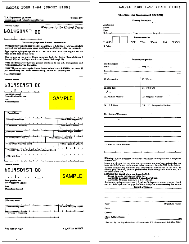
If you have ever filled in a PDF form online, you will start to recognize what a terrible UI a typical paper form really is (in its paper or electronic format). The spaces to enter data often fail to follow a real flow or are too small to be useful, being crammed in to fit the constraints of being printed on a fixed sized page; the notes to assist in filling complex forms are in separate documents or on pages you have to manually scroll up or down to as you enter each response; typically the form can not be submitted electronically even if it can be saved locally. I dislike PDF forms for these reasons, and the fact that they are based on paper forms that were probably designed by 'forms professionals', who probably had little understanding that mere mortals would find them so difficult to understand or use. Even something as deceptively simple as the old US 'visa waiver' for tourists visiting the country required additional 'checkers' walking along the passport control line to validate what tourists had written before they reached the immigration officer, because the form was just so difficult to use. Most people I spoke to found that they could only fill out the form correctly one time in three, and this caused significant anxiety.
In the online world, my preference is always to present an electronic form that is designed for use online. A simple layout of a vertical series of fields enabling the user to always know that the next piece of information to enter is below the previous one, not wedged in a corner filling 'ugly' whitespace. This style is easier to use and easier (and cheaper) to create, so both users and organizations win. If you need a paper form for people unable to submit online (and regulations insist on this for many industries and government), use your current paper form. Don't spend a whole load of money trying to make that paper form electronic.
Of course, many companies and government organizations would not dream of presenting a form that did not look like its original paper version. Maybe this is due to the familiarity that they believe people have with paper forms that leads to less shock when presented with them. Or in a rare case, the form required certification from a regulator, therefore changing the layout is an even more costly proposition. In this case, organizations have to accept that the design of the forms for electronic use will be complex and costly. To do so, ensure that you use a dedicated form design tool that allows you to create the forms and manage their updates into the future.
Unless it has to be done, its always recommended to design and present forms for the medium they will be used in. Paper and electronic media rarely align as we all know from trying to read multi-column PDFs online, so when it comes to requiring data entry, spare your customers the pain of scrolling more than they are typing.
It is hard to attract clients in the first place, whatever service you provide, so its essential to avoid the situation where a prospective customer chooses not to sign up with your organization or for your service due to the anxiety that a complex form gives them. Don't believe me, watch your parents when they see a complex PDF form pop up when they click a link. The expression will be of stress and panic. Do you really want to put your new customers through that?
A post from the Improving It blog
To implement workflow and process automation in your business today, visit www.consected.com
Coming soon... Download the podcast of this blog post
3 comments:
Phil: good to see you online again.
Your summary is right on - understand your audience and present a suitable form. Do not just re-purpose a paper form online.
I've had the chance to use frevvo to quickly assemble online forms and I highly recommend it.
> PDF forms induce stress and panic
?
Anybody with one or more fingers can publish 1-finger hogwash on the web.
Yes, that's why the kept the word 'blog' short. Makes it easier for us to type with one finger.
Post a Comment